

Summary
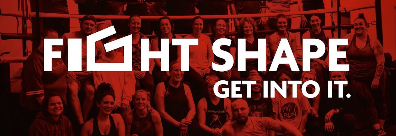
Fight Shape is a growing, community-rooted fitness center in Broomall, Pennsylvania. It’s rated among the best gyms in the region for its boxing- and kickboxing programming and the tight-knit community it has built around a shared passion for fitness. When the gym's owner chose to separate from a national UFC franchise and launch an independent brand, he needed more than a logo. He needed an identity.
With our decades of experience serving clients across industries, Boshā partnered with Fight Shape to build that identity from the ground up: a distinctive visual, a memorable, engaging tagline, and a brand that could grow with the gym.
Listen to the Case Study
The Challenge
Breaking from a nationally recognized franchise brand came with significant risk. For Fight Shape, that separation meant leaving an established company with a strong following. It required that Fight Shape establish its own brand reputation with its own unique visual identity. The owner understood that the gym's reputation, its people, and its culture were already strong; what was missing was a brand identity that could connect with members and speak to the community.
The challenge went beyond designing a logo. It was to translate the gym's personality—serious, energetic, community-driven, and deeply committed to its members' personal growth—into a cohesive visual message.
Like many of the clients with whom Boshā works across industries, geographies, and sizes, Fight Shape initially asked for a design deliverable. What they needed was a more expansive brand identity.
Our Strategy
Boshā's approach began where it always does: listening. The team spent time at the gym, observing, asking questions, and learning. Who trains here? What do members love? What makes Fight Shape different from other boxing gyms? What does the owner want this brand to stand for, five years from now?
From those conversations, a clear picture emerged. The Fight Shape community is made up of serious fitness participants. People who are genuinely passionate about their training, their progress, and each other. The brand would need to reflect that passion.
Boshā anchors the creative direction: strong, modern, energetic, differentiated, and community-focused. From there, the team developed three distinct logo concepts for the client to evaluate.
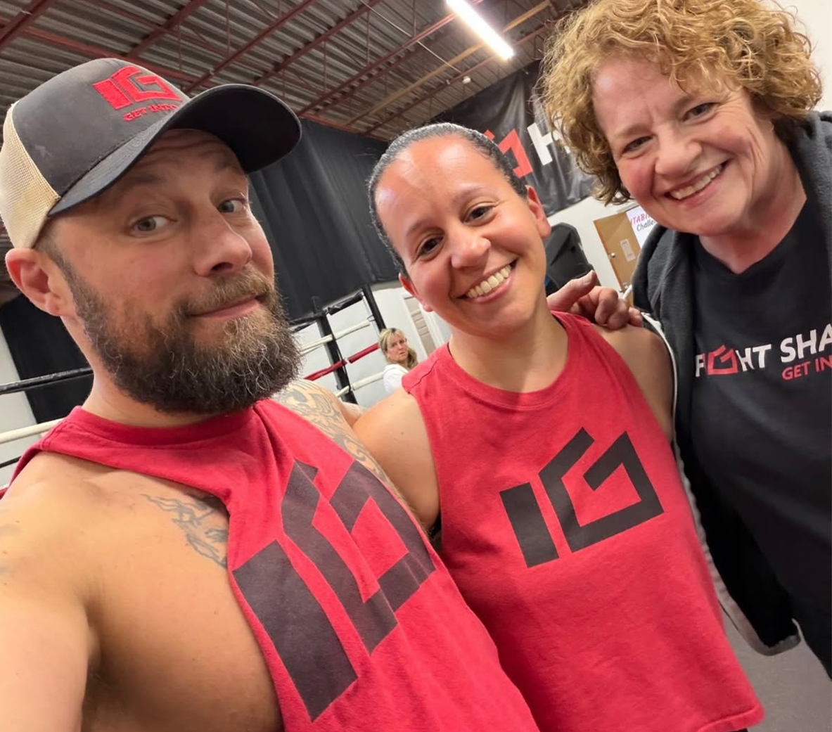
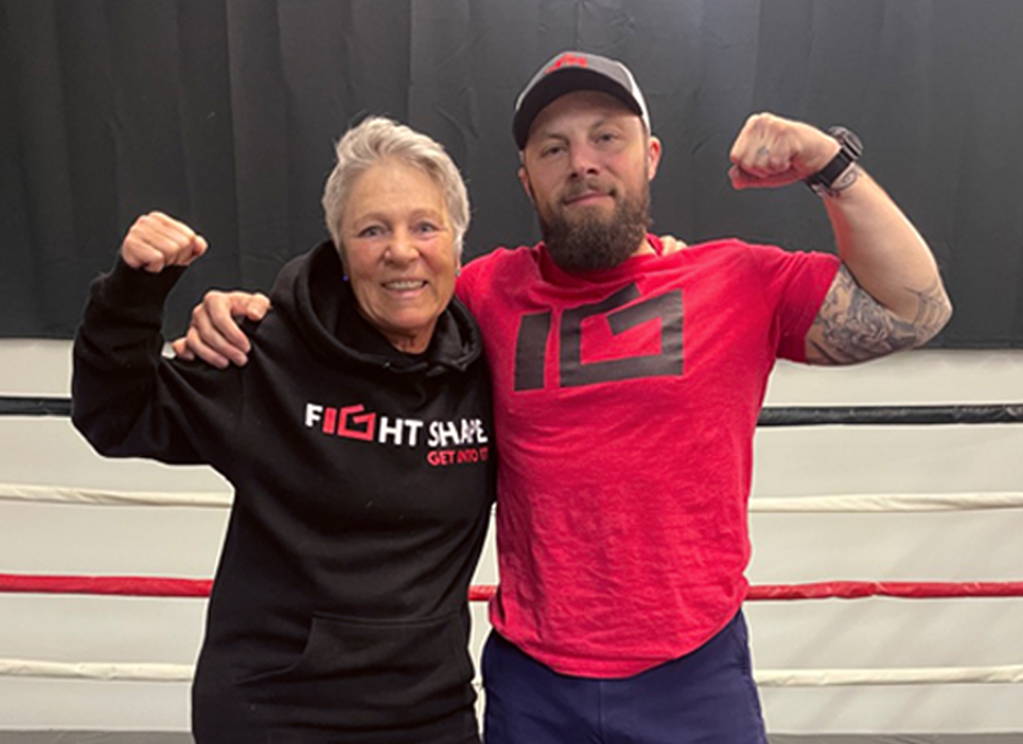
The selected design was distinctive and proved to have appeal to the gym’s leadership and members. It incorporates a boxing glove into the I and G of "Fight" itself, creating a message that communicates the gym's discipline without stating it outright. The color palette of red and black was chosen with intention: red for energy and intensity, black for strength and contrast. Together, they create a visual impact that is bold, clean, and unmistakably Fight Shape.
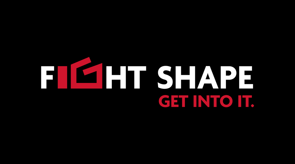
Alongside the logo, Boshā developed a tagline: "Get Into It." The phrase captures the enthusiasm and commitment that Fight Shape members bring to the gym every day, not just their workouts, but their community and their personal growth. It is an invitation and an encouraging message at once.
Boshā's process, informed by years of brand development work across dozens of client partnerships, ensured that every creative decision was grounded in strategy, not aesthetics alone. The logo wasn't designed to look good in isolation; it was built to carry meaning and to work across the many channels in which the brand would live.
The Impact
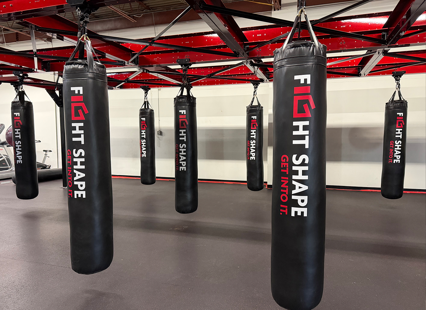
The Fight Shape brand has become a genuine part of the gym's identity and its growth. Since the logo and tagline were introduced, the gym has expanded its presence across multiple touchpoints: outdoor signage, banners, marketing materials, and a regular newsletter. New equipment, including custom punching bags, is being updated to match the brand's color palette and feature the logo. The brand has extended into merchandise and clothing — and it is not uncommon to see Fight Shape members wearing the brand outside the gym, in their daily lives, as a sign that they belong.
On social media, where Fight Shape maintains a significant presence on Instagram, "#getintoit" has reinforced the gym's culture. The hashtag connects individual posts to a larger community identity, something that didn't exist before Bosha's engagement.
Fight Shape is consistently recognized as one of the best-rated gyms in the region, praised by its members for its commitment to helping people reach their fitness goals and for the supportive community it has cultivated.
The Boshā Difference
Clients often come to Bosha asking for simple design help. What they leave with is a brand. The distinction is important. A logo is an image. A brand brings meaning. Brands express an organization’s values, giving an organization something to stand behind and its community something to rally around. For Fight Shape, that brand has become foundational to how the gym presents itself, attracts new members, and deepens the loyalty of the people already in its corner. That is the Bosha difference: decades of experience, a disciplined creative process, and the ability to translate who a client truly is into something the world can see. It’s about quality work and it’s also about establishing lasting relationships.
Case Studies
-

From Confusion to Clarity: Building a Knowledge Center for a Pharma Team
By Christopher Ross
-

Digitalizing Project Management For a Global Pharmaceutical Leader
By Christopher Ross